Made:
Design System from Zero for Blockchain Cultural IP

MADE is a blockchain-powered intellectual property registry built to protect Black creators — giving artists, designers, and cultural producers the tools to register, license, and monetize their work before it gets taken from them.

Challenge: A developer-built React prototype existed with no native design assets. No components, no scale, no usage standards. What existed was a legacy 2021 brand guideline: a manifesto, a logo, a color direction, and photography principles, with no design system to build a product on. The platform needed to feel credible, culturally familiar, and trustworthy to Black creators with limited to moderate blockchain literacy.

Outcomes:

  • Full product UX designed end to end — homepage, listings, product detail, modal system, checkout
  • Elevated from UX Lead to Creative Director mid-engagement
  • A full component library with states and variants.
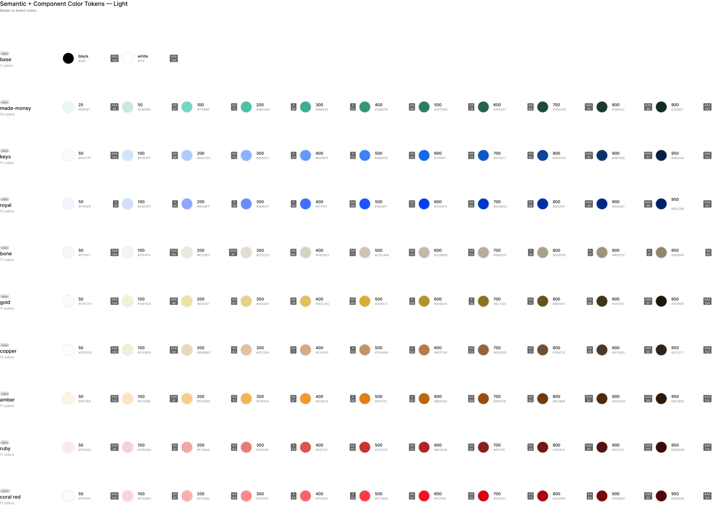
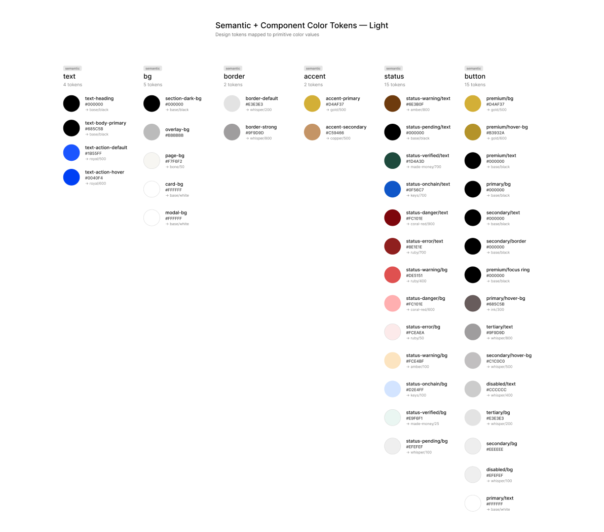
  • Semantic tokens systematized from the brand's color direction
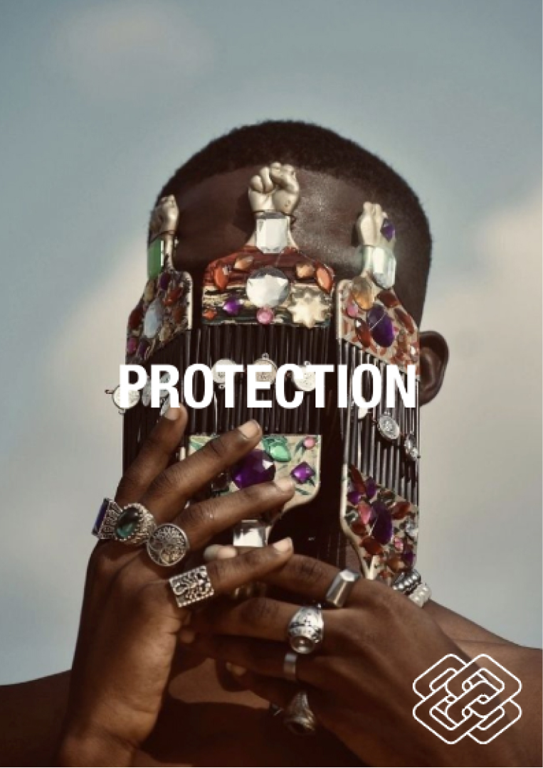
  • Custom blk Chain ID — original verification icon concept rooted in Cuban link chain iconography from hip hop culture
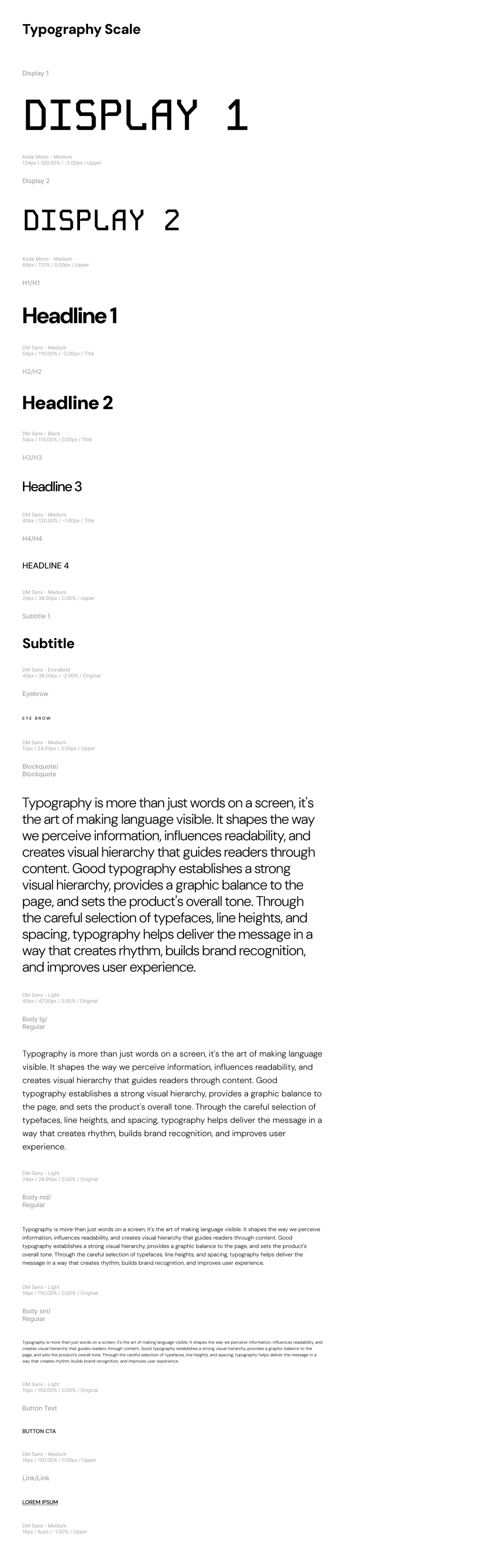
  • A documented type scale
01

DISCOVERY & STRATEGY

Starting with What Exists

Before a single component was built, the engagement began with a full discovery process. A creative brief was authored from scratch — defining personas, success metrics, milestone structure, and risk mitigation. Five design principles were established with the founding team, governing every decision that followed: cultural specificity, trust through transparency, accessibility as equity, creator-first hierarchy, and protection over promotion. The existing React prototype was audited using a structured component extraction methodology — identifying every UI element in the codebase and migrating it into Figma as the foundation for the new system.

COMPONENT EXTRACTION

The audit surfaced a prototype built entirely by a developer without design input — functional but visually identical to every competing SaaS product. Every component was catalogued, evaluated, and rebuilt into a Figma library that the engineering team could work from directly. Project management was built inside Linear — the engineering team's native environment — ensuring cross-functional alignment from day one rather than imposing a creative-first tool on a technical workflow.

02

USER RESEARCH & JOURNEY MAPPING

Designing from Insight

The user journey map became the strategic backbone of every design decision on the project. A casual visitor with vague curiosity about cultural IP protection was mapped across five stages — Home Hero Entry, Home Value Prop, Listing Initial Browse, Listing Filtering, and Property Detail. The map documented goals, actions, thoughts, pain points, emotional states, touchpoints, and design opportunities at every stage. Two findings defined the entire UX strategy: the homepage language was too blockchain-heavy for the target audience, and the platform's cultural differentiation was invisible throughout the entire existing experience.

THE JOURNEY MAP

Every major design decision in the product traces back to a specific finding in this document. The pain point identified at the homepage entry stage — abstract blockchain language creating an immediate barrier for creators unfamiliar with the technology — directly generated the strategic decision to lead with editorial culture rather than technical features. The map turned a gut instinct into a defensible design argument.

03

UX STRATEGY + PRODUCT DESIGN

Every Screen Rooted in Research

The journey map translated directly into design decisions. The homepage could not lead with blockchain — it had to lead with culture. The marketplace had to foreground creator identity, not product inventory. The property detail page had to build trust before asking for any action. Every screen was built from the system's documented components and tokens — no one-off decisions, no undocumented exceptions. The full product surface was designed end to end: homepage, listings, property detail, five-modal system, and checkout.

HOMEPAGE

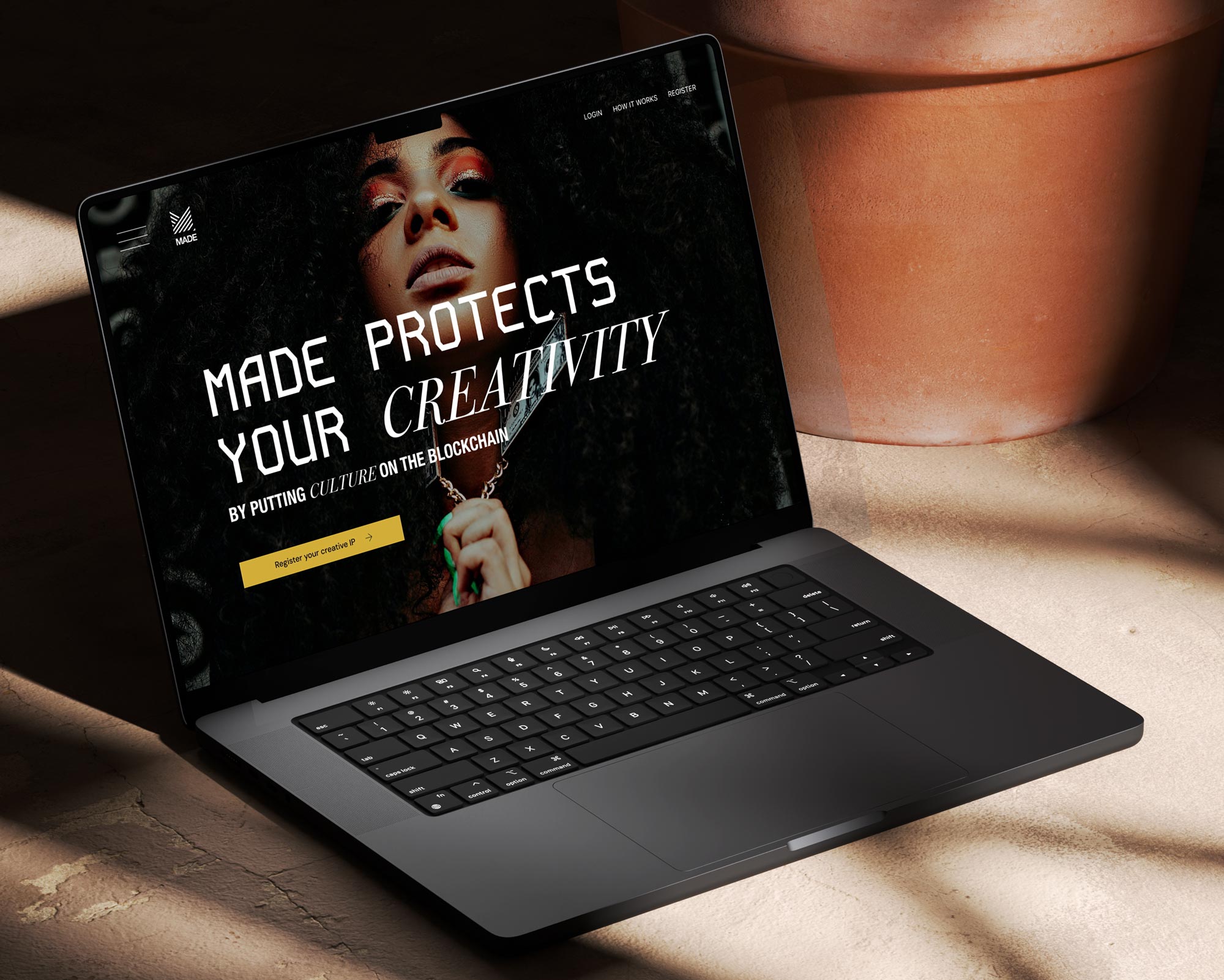
The homepage was designed to feel editorial before it felt technological. Typography was given room to breathe. Imagery was culturally grounded and human-forward. The platform's blockchain infrastructure was deliberately withheld from the hero experience — creators needed to feel seen and respected before the technology was introduced. This sequencing was drawn directly from the journey map finding that abstract blockchain language was the primary barrier to creator adoption.

MARKETPLACE & LISTINGS

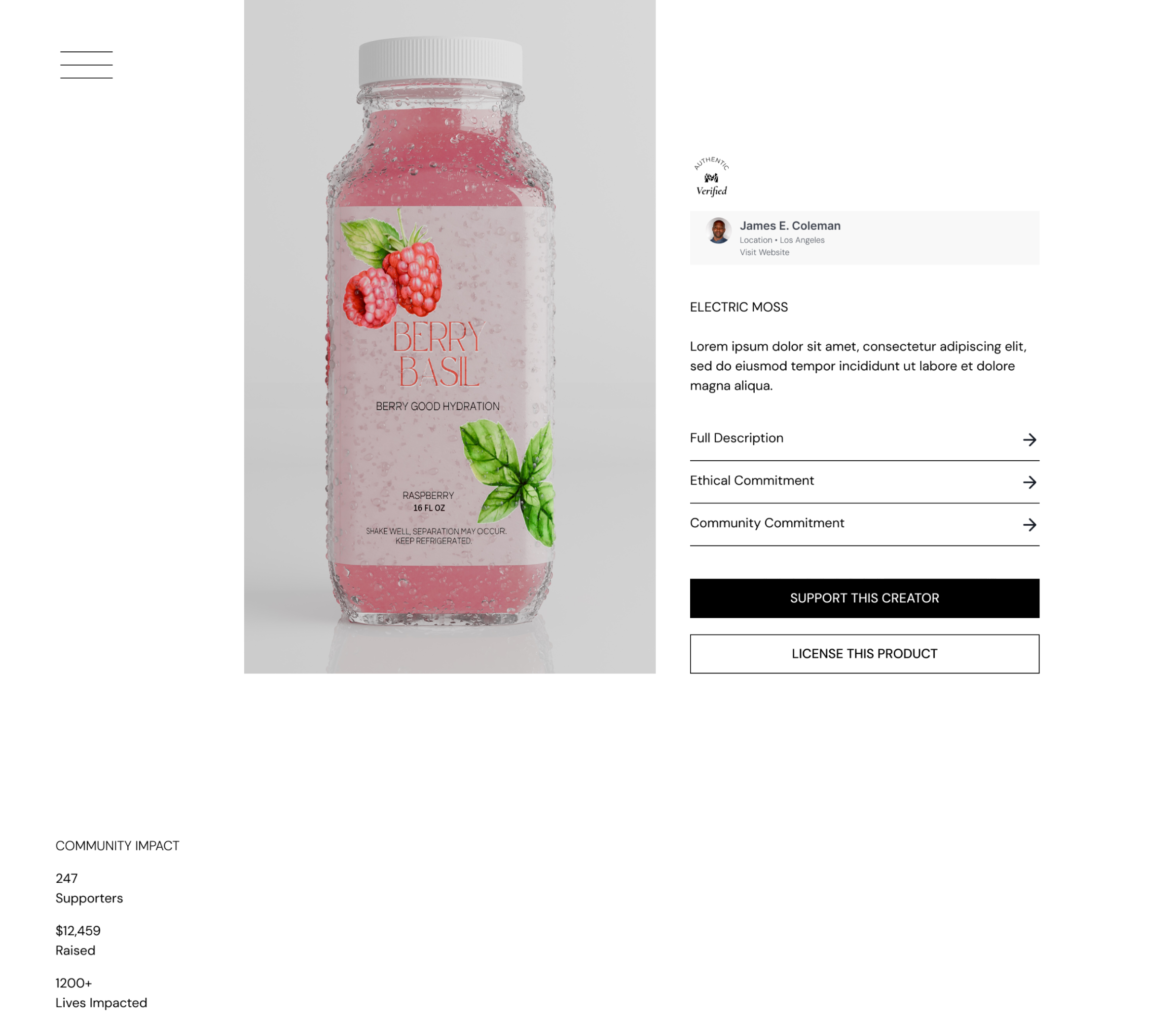
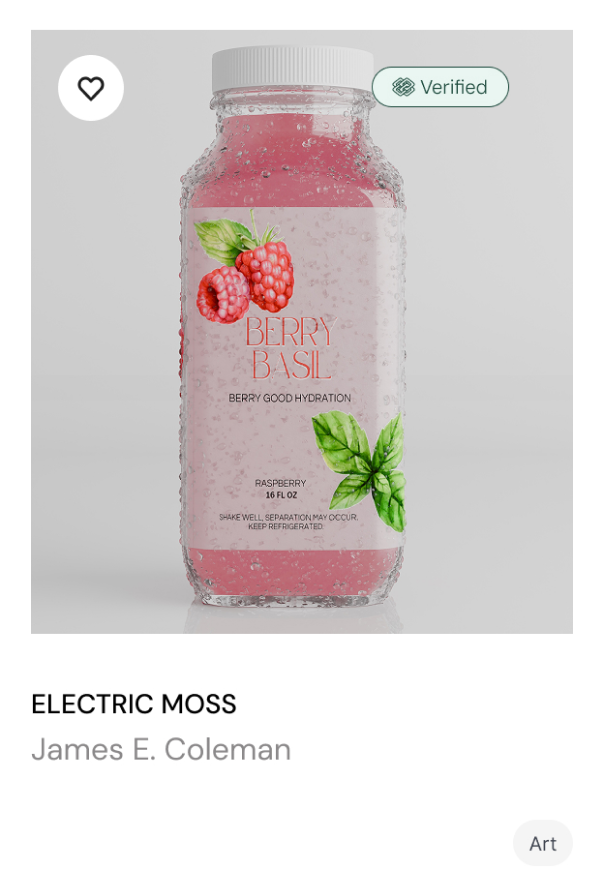
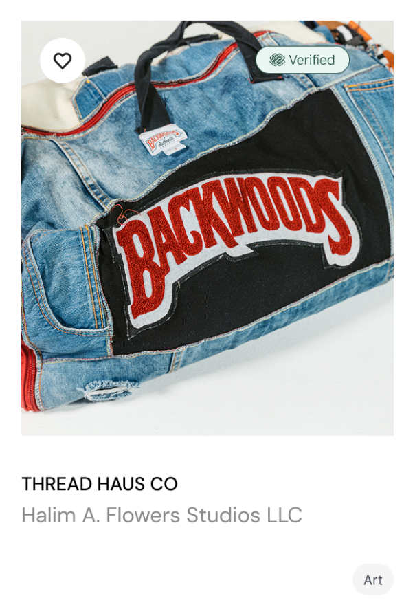
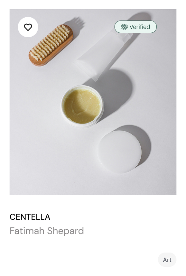
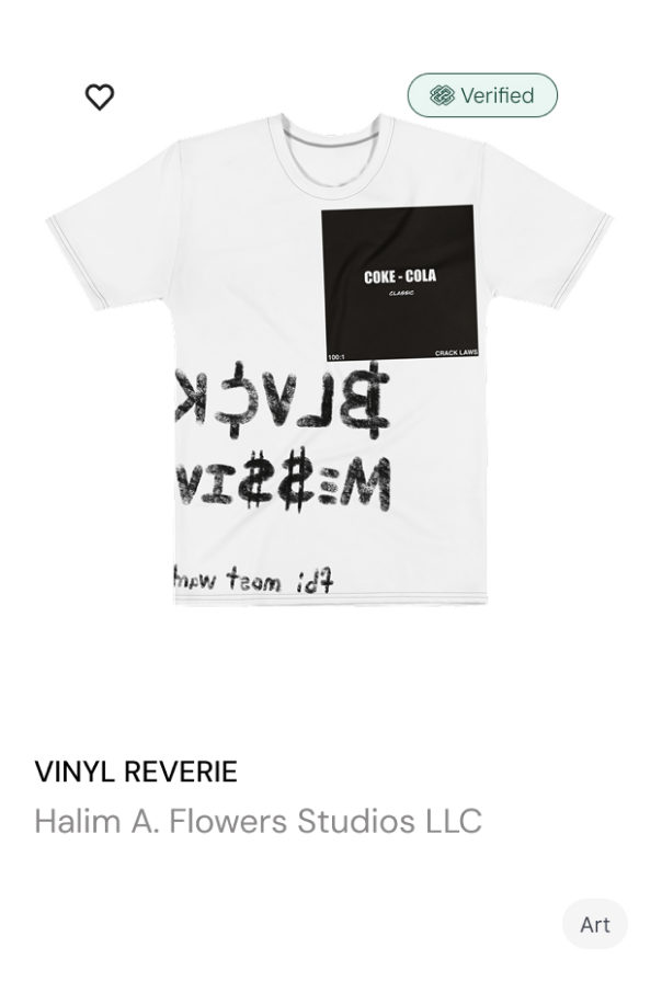
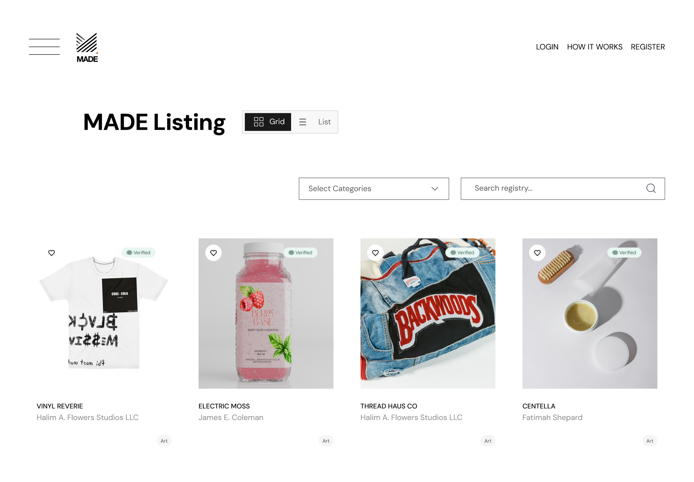
The listings page foregrounded identity over inventory — each listing leading with the creator's name, verification status, and cultural category rather than a price or product specification. The grid was kept clean and editorial, giving every creator equal visual weight regardless of how established they were. The property detail page surfaced three expandable content modules — Ethical Commitments, Cultural Context, and Full Description — alongside community impact metrics: supporters, dollars raised, and lives impacted. The page was designed to make buying feel like participating.

MODAL SYSTEM

Four distinct modal experiences were designed — Cultural Context, Ethical Commitments, Full Product Description, and Navigation — each with its own content hierarchy and role in building trust between creators and buyers. The intent of the Support Creator modal was to convert passive browsers into active community participants through a tiered contribution structure from $5 to custom amounts. Every modal carried the editorial visual language of the homepage into the product's deepest interactions.

04

COMPONENT LIBRARY

Built from Nothing, Designed for Anyone

The starting point was a legacy 2021 brand guideline. It defined an identity, not a system: a logo, a type and color direction, and photography ethics, with almost no usage rules and no product specs. The color direction was the one asset worth carrying forward, and I systematized it into semantic tokens. Everything the product needed as a system, I authored: the typography scale, the component library, every state and variant, and the usage rules that govern them. The system was structured in three tiers, primitive values, semantic roles, and components, so no color, size, or state was ever decided twice.

COLOR TOKENS

Each color was documented not as a hex value but as a usage rule — so any designer or developer working in the system would know not just what the color was but exactly when and why to use it. The full semantic set covered badge states, border treatments, background layers, and interactive indicators — every context the product demanded.

TYPOGRAPHY

Fourteen type levels documented across every specification, from 124px display headers down to 10px labels. The system was built so that any engineer could implement it without a single ambiguous decision left unmade.

BUTTONS

Every button in the product is a single component — four variants across three states, each fill, border, and disabled treatment bound to a token rather than hardcoded. The premium variant enforces dark text on gold where white would fail contrast; the secondary outline carries the heading color so its edge clears the same accessibility bar. Every combination was drawn, documented, and made impossible to misuse.

BADGES

Status is communicated through a single badge component with one semantic property spanning five values: verified, on-chain, warning, error, and pending. Each pairs a soft background tint with a matched foreground from the same token family, so every state reads at a glance without relying on color alone. The set was deliberately held to one intensity rather than a heavy/medium/light matrix; the system says what it needs to with five tokens, not fifteen.

ICONS

A custom iconographic language extends the system beyond interface into brand expression: hard-edged, geometric, and culturally grounded rather than borrowed from a generic library. The set carries the same visual discipline as the type and color systems: one voice, applied consistently from the smallest UI control to full-bleed brand moments. Verification (the platform's most abstract concept) was given its own original mark rather than a stock symbol.

05

CULTURAL CREATIVE DIRECTION

When the Icon Comes from the Culture

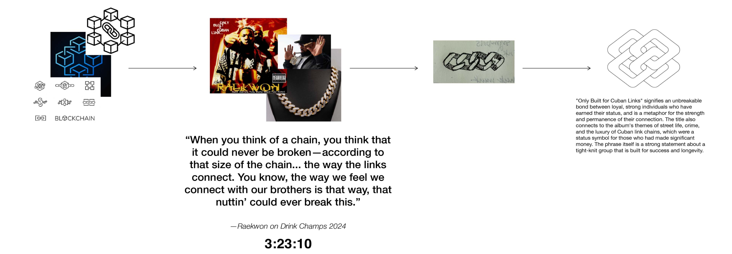
The most technically abstract element of the platform — blockchain verification — needed to feel immediately legible to Black creators who had never used a blockchain product. Generic blockchain iconography was cold, angular, and culturally meaningless to the audience it was meant to serve. The question was not what icon to use. It was what symbol of permanence, protection, and unbreakable connection already existed inside hip hop culture. The answer was the Cuban link chain.

THE BLK CHAIN ID

The Cuban link chain is a cultural artifact — a symbol of earned status, unbreakable loyalty, and wealth that cannot be taken away. Raekwon's landmark album "Only Built 4 Cuban Linx" put the metaphor into language: an unbreakable bond between individuals who have earned their place. That metaphor maps exactly onto what blockchain verification does; it creates a permanent, immutable record of ownership that cannot be broken or disputed. The concept moved from cultural reference to hand sketch to refined icon. The blk Chain ID was applied across the entire product surface — on editorial photography as a watermark of protection, on listing pages alongside the Authentic Verified badge, and on dark section backgrounds as a standalone blockchain verification signal.

06

CLOSING

Protection Had to Feel Familiar First

The brief disguised itself as a visual problem. I diagnosed it as a trust problem. A blockchain platform asking Black creators to register their life's work had to earn belief before it earned action, and the experience it inherited led with the one thing that created distance: the technology. Every decision in this system was built to reverse that order. Culture first, proof second, the ask last.

That sequence wasn't a preference. It came directly from the journey map, where abstract blockchain language was the first barrier a creator hit. The fix was not a nicer interface. I identified it as a different point of entry: lead with the people, make verification legible through a symbol the culture already trusts, and let the technology recede until it was earned. The blk Chain ID exists because protection had to feel familiar before it could feel safe.

This is how I work. I read what a brand is trying to become, diagnose the real problem underneath the stated one, and build the system that makes the right decision the only easy one to make. For MADE, that meant a product where cultural specificity is the strategy instead of a layer that sits  on top of it.

UX Design, Visual Design

method®:
Interactive Quiz

UX Design, Visual Design

Mozilla:
Microsite