

overview


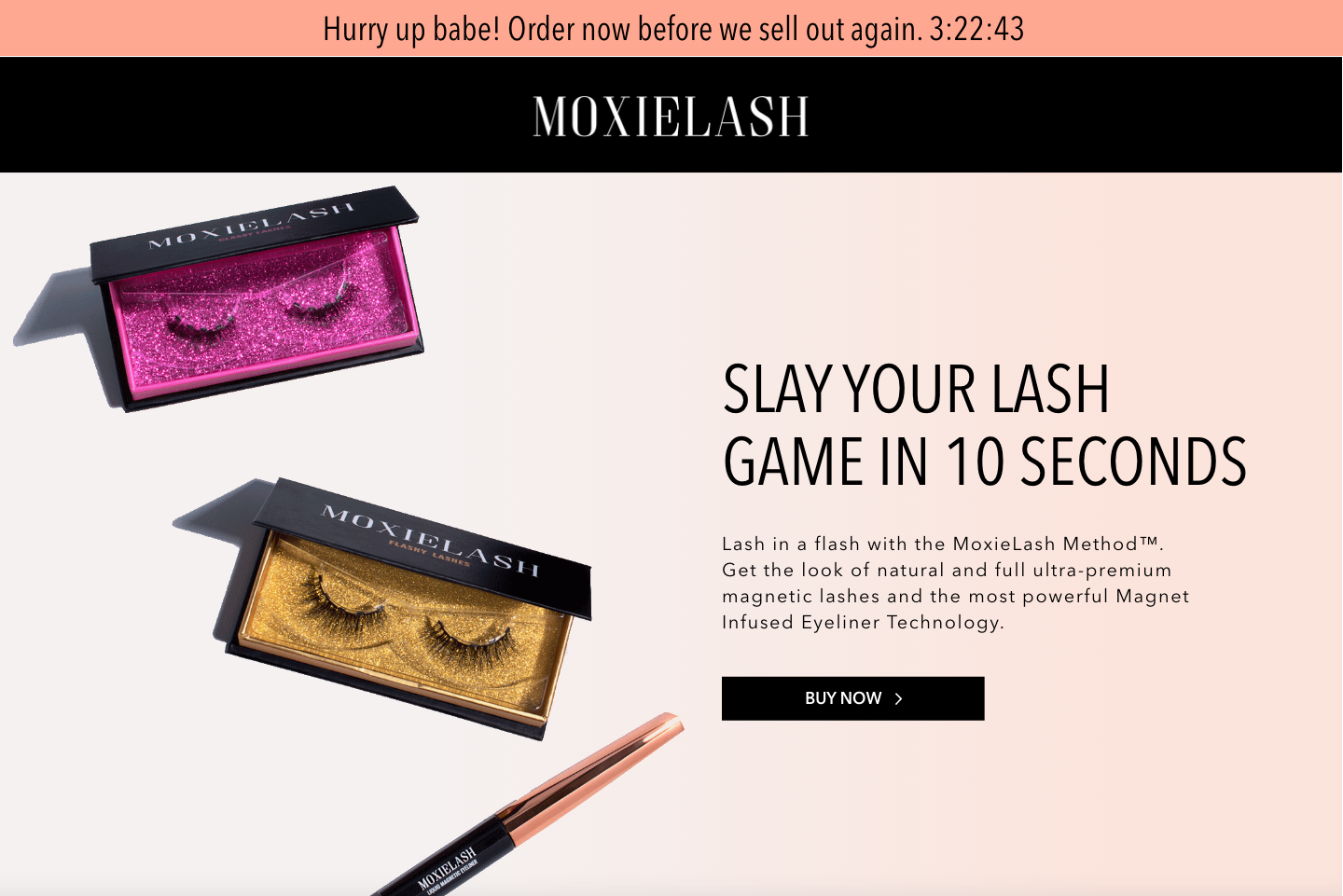
Moxielash is an innovative beauty brand that leverages magnetic-eyeliner technology allowing its customer to apply false eyelashes in seconds removing the complexities of traditional false eyelash application.
challenges
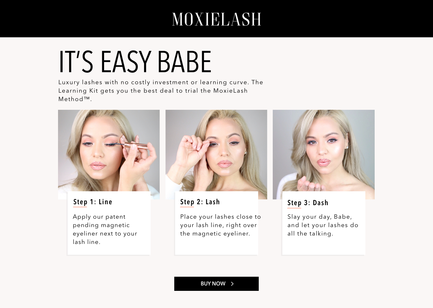
Novel magnetic technology caused high customer friction. The existing store pushed products before teaching application, stalling conversion with discerning buyers.
outcomes
Architected an editorial sales engine that pairs immediate application clarity with a elevated brand identity—driving higher AOV and seamless onboarding.

brief
Audited engagement drop-offs and operational roadblocks to realign stakeholders around a single objective: total clarity on the core application method.
principles
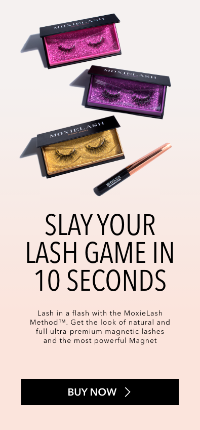
Shifted focus from raw product specs to digestible, confidence-building content that inspires instant purchase of the MoxieLash Starter Kit.
alignment
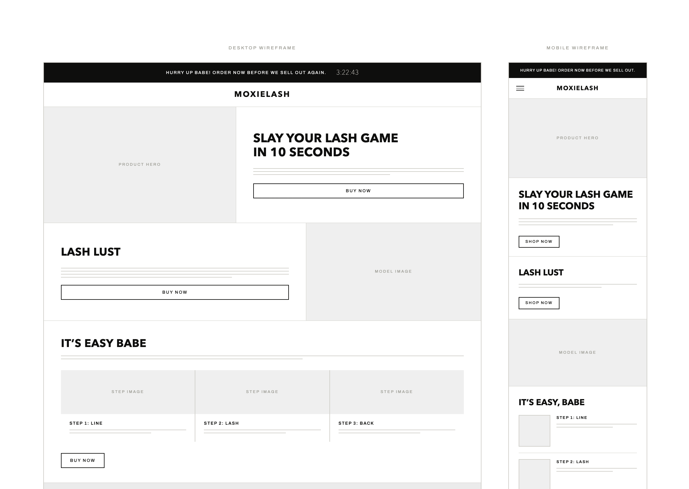
When initial UX explorations drifted from business targets, I redirected strategy—using priority guides and wireframes to turn content priorities into frictionless, high-converting layouts.

identity
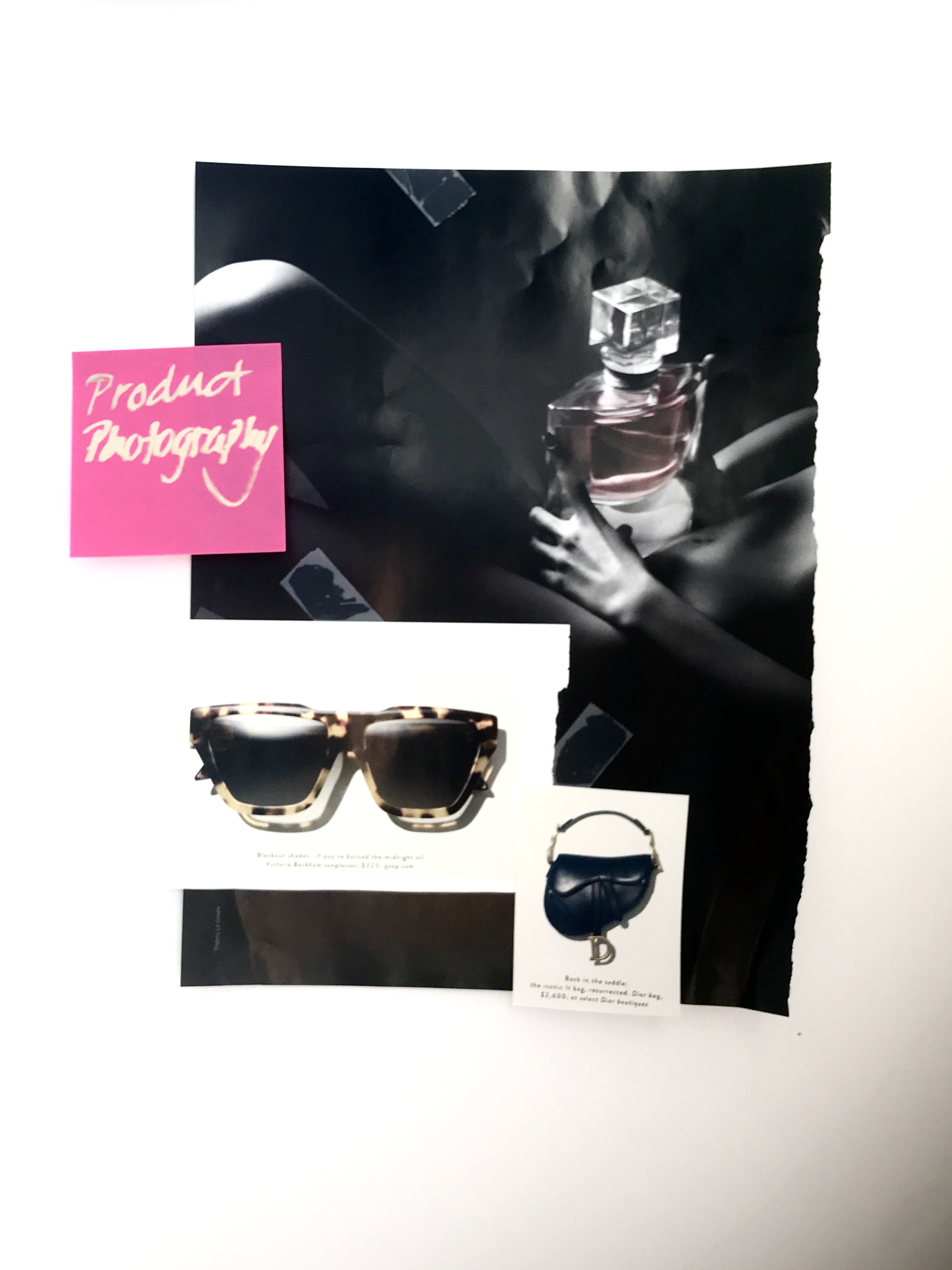
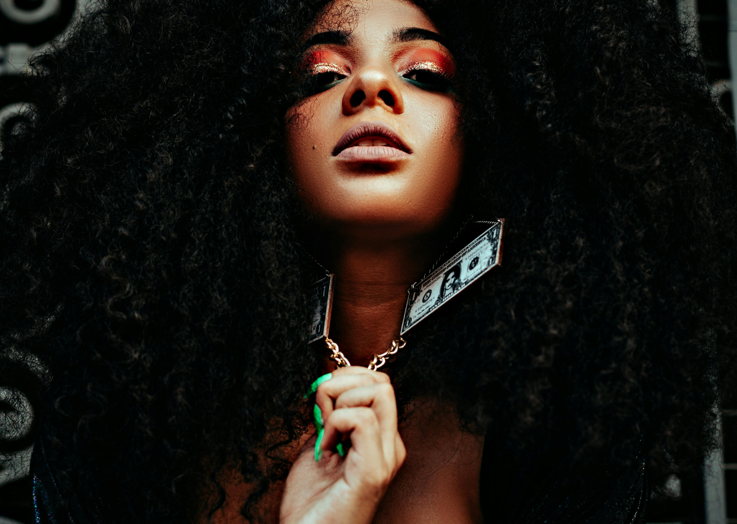
Distilled modern beauty influence into a refined, powerful aesthetic balancing soft, approachable confidence with high-end editorial luxury.
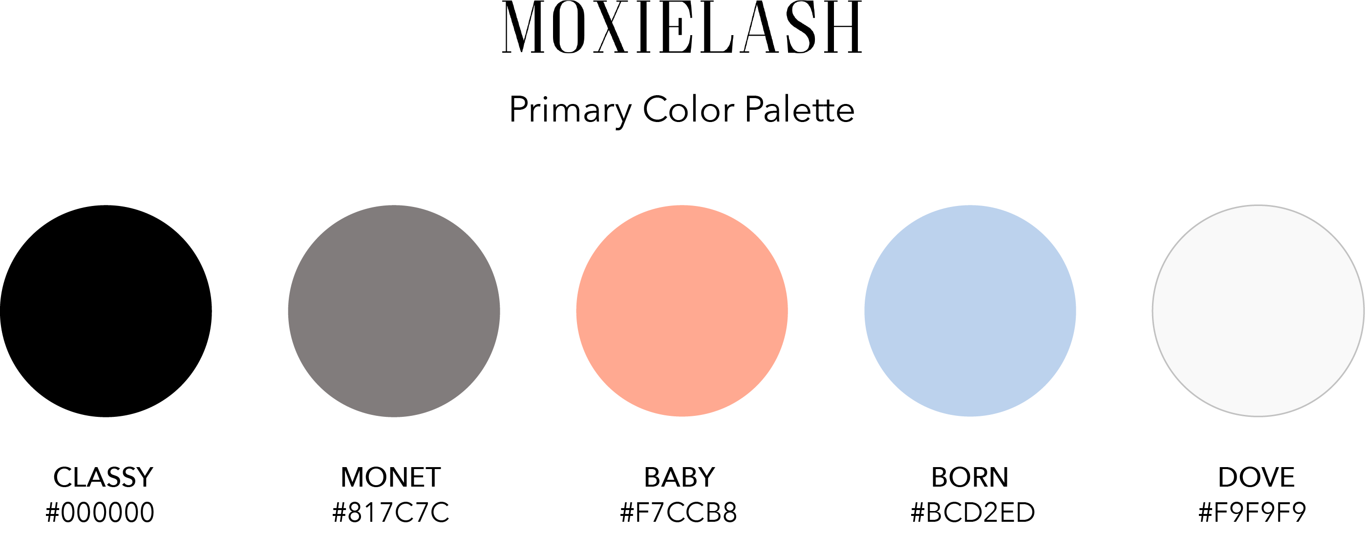
palette
Art-directed color tones directly from high-performing beauty creators to establish immediate cultural relevance and premium visual trust.
Type
I selected Avenir Next for its geometric precision and subtle warmth, structuring a scalable hierarchy across 14 documented typography levels.
tangible
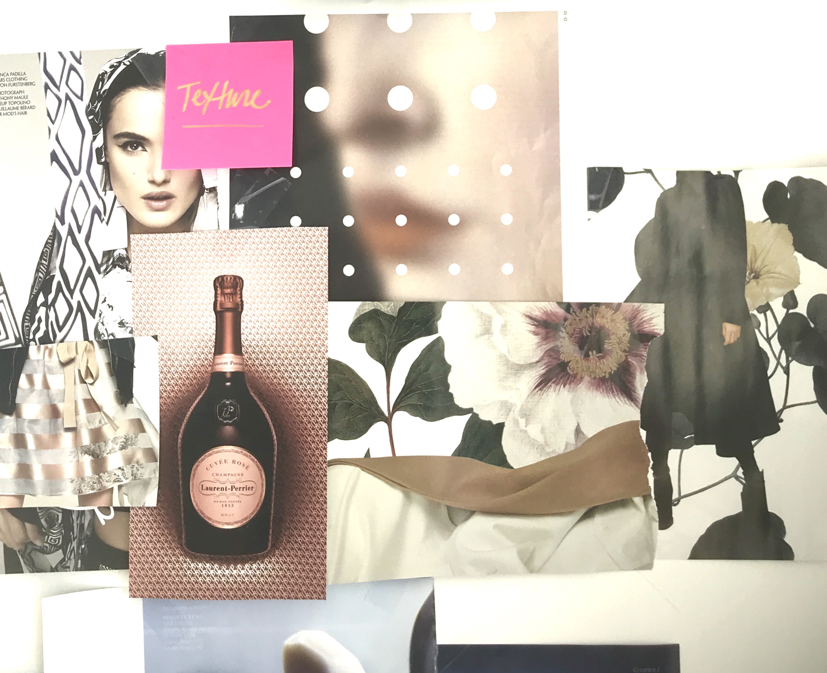
The digital moodboard just wasn't enough to spark the kind of creaitivity to inspire the new direction. The creative team and I wanted to bypass potential creative blocks by touching paper, and go crazy.

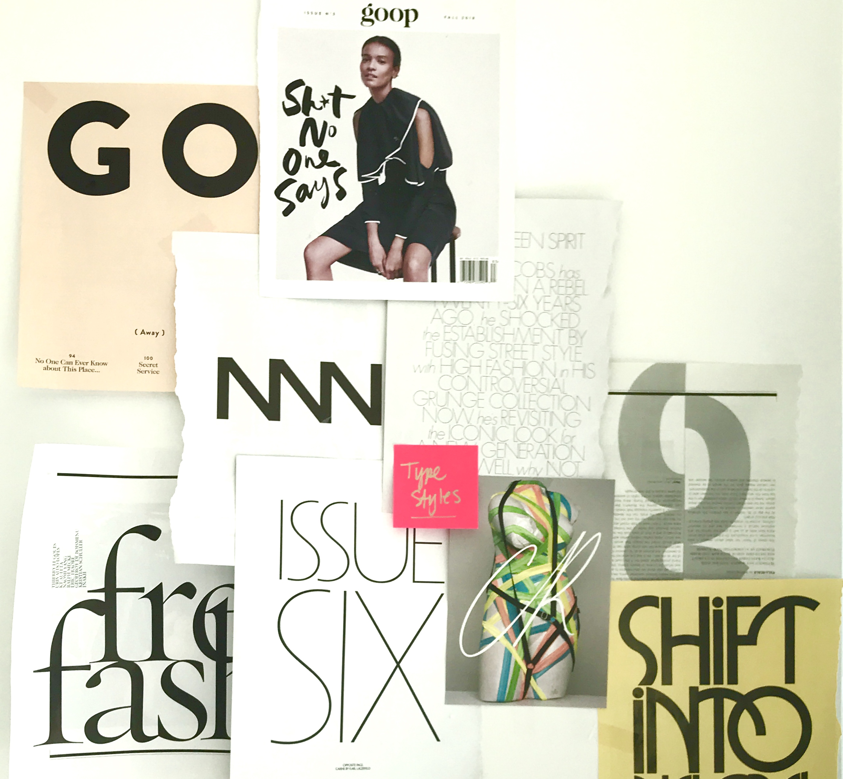
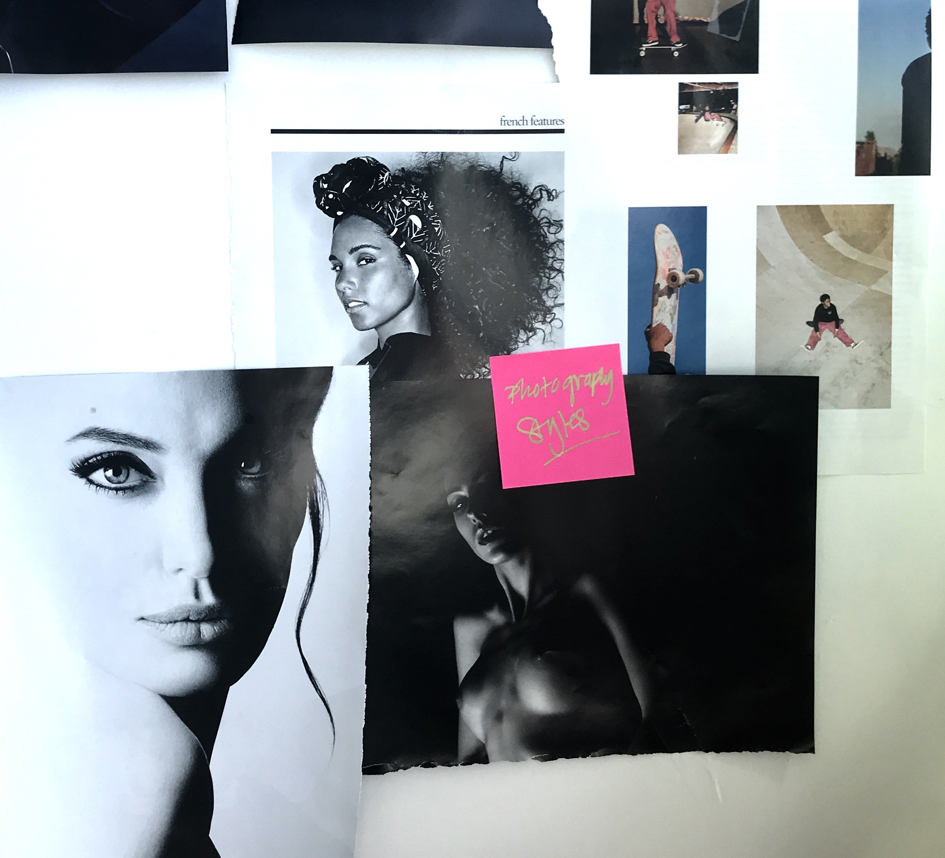

EDITORIAL

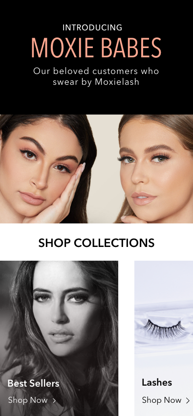
I famed the storefront like a luxury fashion magazine cover, hooking visitors with high-impact visuals before transitioning into conversion modules.
onboarding
I architected the layout flow to make users feel inspired and aligned first—demystifying application mechanics right at the moment of intent.
conversion
My intention was to create modular product cards and instruction blocks to guide buyers seamlessly from initial discovery to confident checkout.

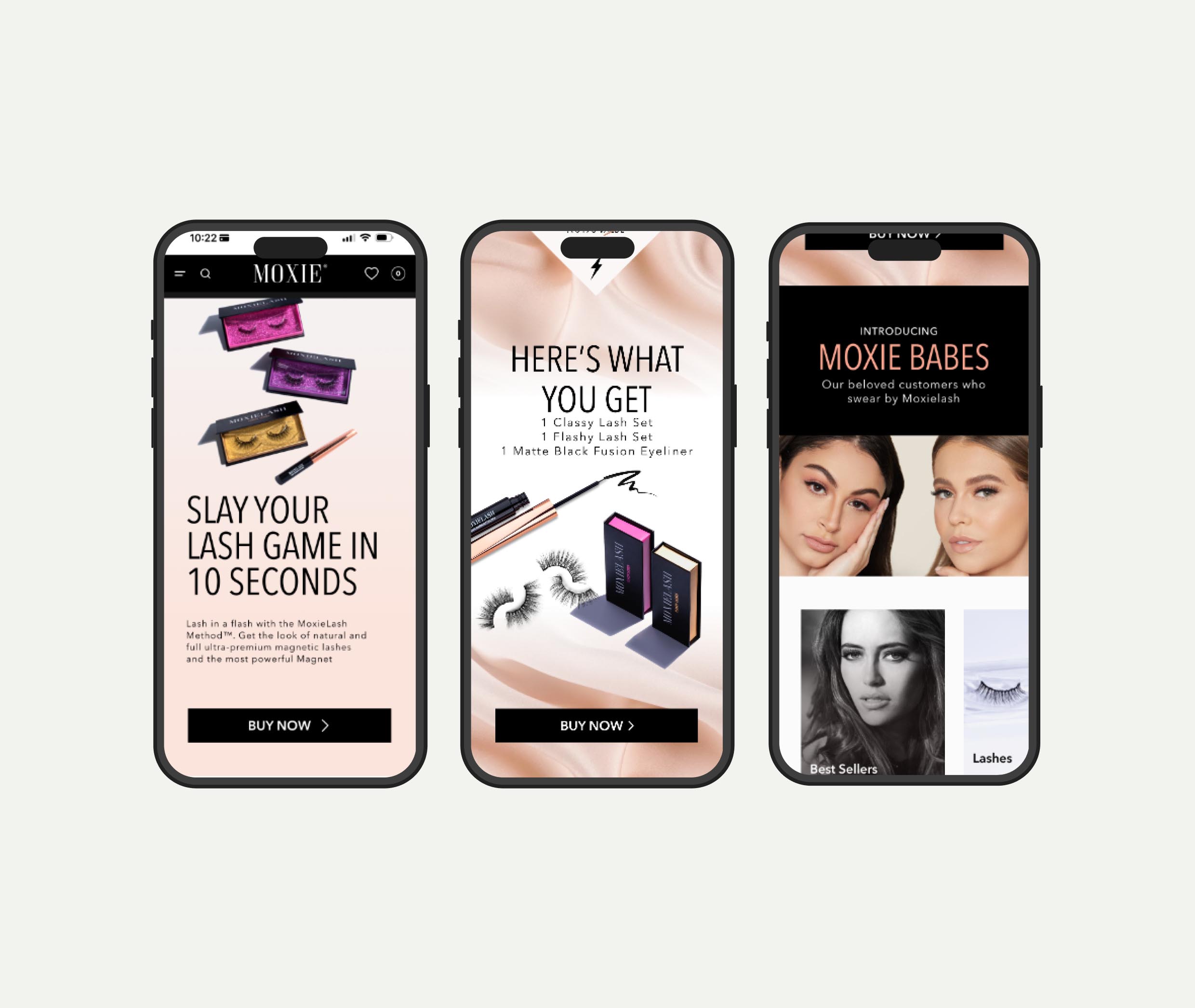
Led the UX, creative and product strategy while building a complete design system using Figma, Claude, and rapid visualization methods of design thinking.
Redesigned Moxielash's sales page while simultaneously redesigning the brand and restructuring operations with a documented process for the creative team.
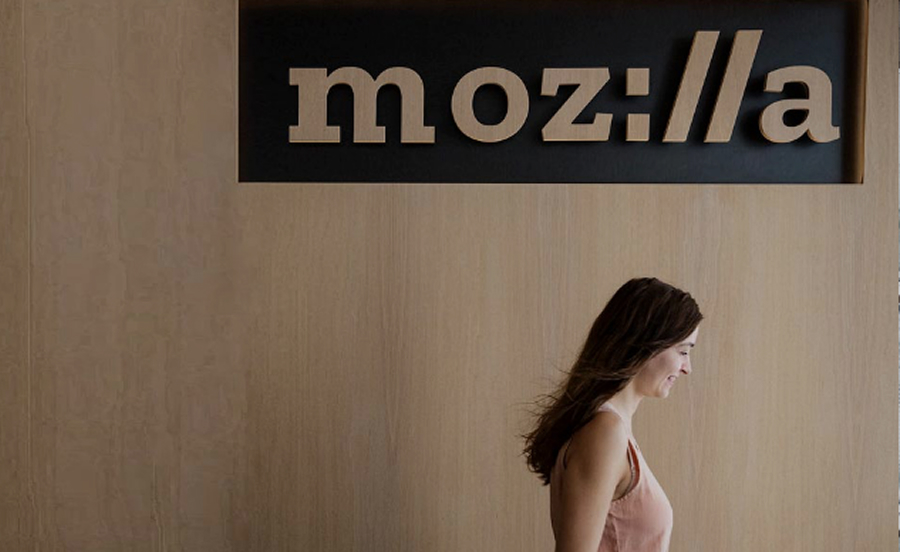
Contributed to Mozilla's milestone rebrand, designed microsites and created a multitude of assets for the marketing team.
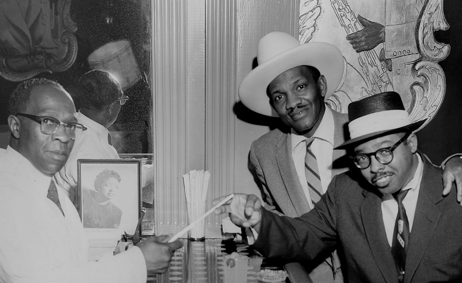
Designed the brand for the inaugural San Francisco Juneteenth parade.
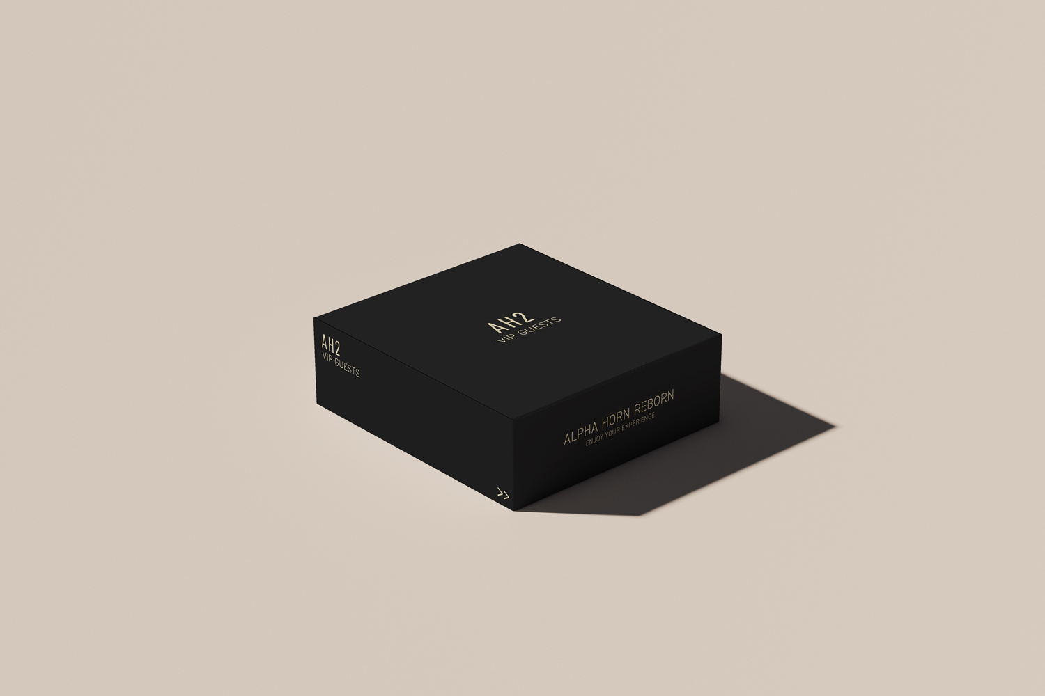
Designed and developed an accessible-luxury brand from scratch to position AH2 Hospitality Group for global expansion.